

|
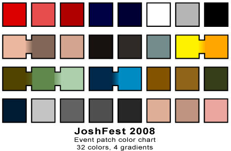
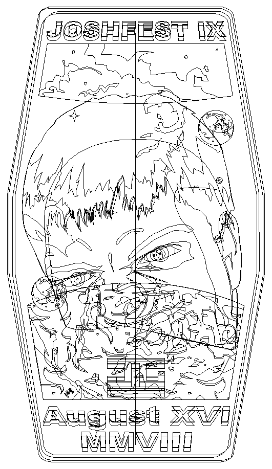
13 July 2010 INTRODUCTION I know that this article is coming a year late and that pretty much everything that has to be said about last year's JoshFest has already been said. I've long since thanked people, posted my photos, rehosted Charles' photos, and archived the live-blogging Tweets. A year has very nearly passed and the date for this year's event, in just a month and a day from now, has already been posted. So why am I returning eleven months later to JoshFest: 2009? The reason is because there has been one last thing that I have been sitting on, one last piece of business that has been bothering me. The one article that I've been meaning to write but, for whatever reason, have not. That is the article about designing the 2009 event insignia. I wrote an article of this sort for 2008 and have wanted to do the same for 2009. That I'm still irked by this after eleven months means that I should just sit down and write it to clear my conscience. All graphics link to larger images. CREATING TEN YEARS JoshFest: 2010 was the tenth event in the JoshFest series which, for all intents and purposes, began happening in 1999. There was no event in 2001 because I chose to just skip all birthday acknowledgments that year (I was at a fussy crossroads in life at the time). So, ten events between 1999 and 2009. When it came to designing the event insignia I knew that the ten-year thing should be a consideration as it drove home the idea of diluting my birthday into a pile of bureaucratic paperwork, that the non-birthday belongs to a series whose own internal dating scheme is more important than my own age. With that in mind I briefly considered paying reference to the event insignia for JoshFest I, way back in 1999. This was a short-lived thought because I only began doing event insignia in 2007, with JoshFest VIII being the first to receive one. The previous seven insignia were designed retroactively en mass in August 2007 in order to have a full series ... for the noble sake of the bureaucracy, of course.   When I drew the Josh: 1999 insignia (it did not become "JoshFest" until 2002) I was trying to be mindful of creating an emblem that looked like how I drew things back in 1999. The Mission Patch Emporium was the best place to find clues as, by the time of that 1999 party, there were already eleven relationship patches completed. Bearing in mind that in 1999 I would have drawn the insignia in CompuWorks Draw2, which did not handle complex graphics very well, I just stuck with a simple black and white circle and the starburst element that made its way into so many relationship patches as an easy-to-render flourish. The type style was copied from the guest list which I still had a copy of. The text is actually the ESPN font which, when you don't put those four letters together in a row, makes for a nice future-tech typeface. Not that any of this mattered in 2009. It didn't make sense to pay homage to a design that didn't exist at the time I was hoping to reference. POSTERITY FROM SCRATCH Thirty seconds after considering the retroactive Josh: 1999 patch as a source of inspiration I decided to move onto greener pastures and just come up with something that invoked ten years' worth of JoshFests without necessarily acknowledging any other insignia from the series. This also meant establishing some design guidelines. These basically amounted to, "Remember the 2008 insignia? Don't do that." The JoshFest: 2008 patch was too big, too busy, and too colorful for what I wanted this time around. There was much more detail there than I wanted to do for 2009 and I nearly exhausted the color spectrum trying to render it all. For this auspicious tenth anniversary it would be prudent to follow the KISS rule: Keep It Simple, Stupid. So I sat down on July 29, 2009 and scribbled off a page of concepts. The shapes on top are attempts to make a stylized Roman Numeral "X" as the basis of the patch. The drawings at the bottom narrow down the elements and themes that I wanted to use.  So obviously, nearly from the start, I wanted to have a big ole "X" formed by a starburst shape. This would not only make the "X" a major design element at the forefront of the insignia but also just subtle enough to not immediately scream out "TENTH JOSHFEST HEY!" As you can also see, I wasn't sure where else to go after that and kept trying to draw spiffy space scenes with Earth, the moon, and other planets. While the design on the far left is what I eventually wound up going with, it wasn't until the shield design on the far right failed. CARRYING THE SHIELD INTO BATTLE I liked the look of the shield concept. It invoked a sense of nobility and age, both of which seemed appropriate for the big ten-year theme. It was easy enough to draw in Adobe Illustrator and, combining it with the far-reaching flare of the far-left concept scribble, created a unique patch that wasn't all that difficult on the eyes. The problem, as it became, was what to put inside that huge open area on the shield. At the time I had drawn this I was just a week past having spent nine days typing up daily journal entries for the fortieth anniversary of the Apollo 11 moonlanding, charting that mission across its length. Given that 2009 was the fortieth anniversary of that first moonlanding it seemed like a proper reference for the JoshFest patch. I mean, it was a pretty big deal to me even if no one else thought too much about it. I added the Apollo Command and Service Module with the Earth and moon. It wasn't bad but I felt that it completely missed the point of JoshFest. I had also tried a balloon, in recognition of JoshFest: 2008's theme, and that didn't work either. I did put together an Awkward Club variant (much easier to fill up space with) of this design, but I'll discuss the JoshFest Awkward Club in more detail later on. These early designs did establish the color theme that would be carried over until the end. The starburst was always going to be yellow and orange. That shouldn't come as a surprise. What I wanted throughout was a much more subdued and less vibrant color palette than the 2008 patch. Colors that were less overtly in your face. I made the outer ring a sort of lavender, not only because it was a much-diluted shade of the blue that made up the interior and border, but because I often try to work purple into the insignia I design. Remember, these event insignia were originally inspired by NASA mission patches. In those, purple tends to be a non-existent or, at best, hugely underrepresented color. I try to include purple just to be different.   That wasn't working at all. In fact, it was failing spectacularly. In a last stab at this design I tried inserting myself. I didn't want to do the big, detailed Josh face from the 2008 patch (which had only been drawn down to the nose anyhow), so I opted for the silhouette from the bottom of the Movie Marathons site.  That was just crap. I threw in my chips and started over. SIMPLIFY, SIMPLIFY Apparently I forgot my own design rule about keeping it simple. Stupid. Right there on my concept sketch sheet was a simple, straightforward design that didn't call for any lavish scenery or extraneous elements. I did a straight run of it with a circle for the backdrop, though copying over the starburst and extended flare from the shield design without modification.  Not bad at all. It didn't leave any room for text, but that was easy enough to correct. The circle just had to be expanded and stretched into an ellipse. In doing so the proportions of the starburst no longer worked so that too was stretched to fill out the new shape. I overdid it and wound up creating this "super tall" insignia.  Well now, that just looks silly. Downright ridiculous even. So I scaled it back and spread the points out a bit. I also added some lavender arcs on either side. Think of them as lens flare since I haven't a better explanation.  By this time it was August 7 and I had been staring at variations of this patch for the past week. I needed some outside opinions. CALL IN THE CAVALRY After a week of having this patch burned into my retinas I began losing the ability to judge it fairly. My eyes were glazing over and, while I knew something wasn't right, I felt I'd exhausted the possibilities of what that something was. So I asked Charles and Felicity to take a gander at the drawings on my monitor when they were over for movies. They weren't a big help and basically told me that it looked fine. No good. So I did what I should have done earlier: I asked Laura. When in doubt on a design, ask the art major for advice. It worked before when I similarly glazed over on the Google Lunar X Prize t-shirt design and, although I lost that contest, I was personally very happy with my finished artwork. So I asked Laura: The first (with the oval base) is how it stands right now. The second (with the shield) was the first pass. I'm pretty intent on keeping the big yellow star element (the flares form a Roman numeral X, this being the tenth JoshFest, with the top left flare stretching back towards the previous years). I just can't seem to make it all go together.Laura, bless her heart (to say nothing of her keen eyes), came to my rescue: I really do like the oval patch, honestly. It has a much more commanding presence. One thing I can think of changing is the length of the star's "arm" that reaches way out to the little star. Perhaps it can be shortened a wee bit? I like the drama of the length, but toning it down might be an interesting possibility. And the ONLY other thing that might bother me is the size of "JoshFest." I think that deserves a bit more presence, too. But other than that, I really like it! Simple, yet very striking.As it turned out, this was exactly what the insignia's problem was. She hit the proverbial nail on the head. Given how long it took me to arrive at this point, it took very little time to implement these suggestions and finish off the JoshFest: 2009 insignia on August 8. Done!  I responded: On the newest revision I shortened the upper left flare, which pulls everything closer together and makes it far less unbalanced. I also expanded the light-lavender ring by shrinking slightly the inner blue oval and expanding slightly the lavender and blue outer oval. This allowed the JoshFest title a little more space to fill. To offset the title I also shrank the date just a smidge.And that was it! I was finally happy with the insignia and called it complete. It was posted online for all to see on August 9, just six days before the event was to kick off. Oh, and also? I only used four colors. This is opposed to the thirty-two colors (with four gradients) on the 2008 insignia.  Bam! AWKWARD CLUB AND LEDERHOSEN 8 JoshFest: 2008 introduced the concept of the Awkward Club. Given that these events might pull folks together who would rather not be around one another, the possibility for awkward tension might arise. Luckily the bureaucracy thinks of everything and has a special variant patch for those anxious individuals. The armadillo is the chosen mascot for two reasons. One, Charles and I realized that we knew next to nothing about their lifestyles, and two, they strike me as awkward animals. Maybe it's just me.  Lastly, though it was never an active or defining thought during the JoshFest: 2009 insignia design flow, I thought it's worth mentioning the close resemblance to the Crew 10 patch that I designed for my (now-defunct) Lederhosen 8 space station. That patch has been hanging on my wall since the July 3, 2007 launch because it was the last crew to that station and just has not been replaced yet because my Lederhosen 9 plans fell so far behind.   Consider the Lederhosen 8 patch a cousin to the JoshFest: 2009 insignia rather than the former directly inspiring the latter. Since I designed both of them within a two-year span it's clearly a design idea that I'm prone to coming up with. All of the Lederhosen 8 crew patches resemble numbers, either Roman or Arabic Numerals, so that was probably inevitable. I wanted the same idea for JoshFest X, though not by deliberate intent, and came up with a similar design ... although in a more roundabout manner. If anything, the JoshFest emblem is a more mature take on a related design concept. AT THE PAR-TAY JoshFest: 2009 was a blast and a half. I won't go on and on about how much fun it was because I posted all those links in the introduction that do just that. I just want to mention the instances of the completed insignia at the party. Two copies were printed on cardstock and cut out. With all of the tiny points on the starbursts and the sheer fragility of the whole thing, it took about fifteen to twenty minutes to very carefully cut out each emblem with an X-Acto knife. One of these was displayed in the normal location for event insignia on top of the television while the other joined the "progression of patches" along the bookshelf. This lineup displays all of the special event insignia that have been created in the year that has elapsed between JoshFests. At the end of the party Marie claimed one of these cut-outs for herself.  Two other printouts were left uncut from the cardstock. One hung on the wall behind the sofa, as all event insignia do, and the other was on the table as part of a stack of similar printouts of the previous nine JoshFest emblems. What may become a new JoshFest tradition provided me with a unique souvenir when I got all of the attendees to sign a copy of the insignia.  Now isn't that nifty? CONCLUSION By the time I've gotten around to writing this article I already have two sheets of concepts done for the JoshFest XI insignia. It'll be another week or so before I expect to begin drawing it in Illustrator. The concept that I'm currently leaning toward is one that I don't think should present too many headaches and should be fairly fetching to boot. I might come up with something better between then and now, but whatever I come up with, I'm sure to wind up writing another of these articles on designing the JoshFest insignia. Now that I finally have this one done I can sleep better at night.  Articles Articles
|
 |