


|
2 August 2012  INTRODUCTION Talk about coming up short! Not only have I barely written anything since the start of the year but what I'm about to write is simply tying up loose ends from 2010 and 2011. As we march into August 2012 and have JoshFest XIII just around the corner, I feel compelled to finally stop being so ridiculously lazy and write a combined article on the JoshFest XI and XII patches. I could easily pan them out to two separate articles but, at this point, melding them into one is probably the most efficient thing to do. As with the 2009 patch from JoshFest X, which I dawdled and delayed writing about for eleven months, the writeups on these two designs fall under the "better late than never" category. Why even do them at all at this point? Well, because: 1) I enjoy writing these articles, even though I put them off seemingly forever, 2) I'm obsessive-compulsive about needing to finish them, and 3) I like showcasing the design process and rejected ideas. That, and I've had all of the graphics ready for this article and sitting in a folder since last November. So before I have to include the 2012 patch in this to-do list, here's the much-delayed behind-the-scenes on JoshFests 2010 and 2011. All graphics link to larger images. 
2010: JOSHFEST XI BRAINSTORMING FOR ELEVEN The patch for the tenth JoshFest in 2009 changed things up a bit. The nine before it (actually two, plus seven drawn retroactively) had been all over the map with no consistent style. Which is fine! In fact, that's great! Every year should stand on its own, with a unique insignia that needn't relate to any that came before it. There's no problem there. But focusing on 2009 being the tenth event and designing that patch with an emphasis on the Roman Numeral element kind of altered the flow. Prior to this, while I had obviously been counting them and including the number on the patches, that idea hadn't really carried over into the public perception. In my head and worksheets I called them "JoshFest VIII" and "JoshFest IX," and so on. But everyone else knew them as "JoshFest 2007" and "JoshFest 2008," which were the titles I gave them on all releases. The JoshFest X materials carried on so much about "ten years" and "Roman numeral 'X'," that people other than me began referring to them by their series number rather than by the year. The consequence was that, in 2010, I began thinking more about the numeral "XI" as a much more central element than it otherwise might have been. There were also a couple attempts to use the Arabic Numeral "11," but its resemblance to the Roman Numeral "II" made it impractical. (For comparison, look back to the early design process on the 2009 JoshFest X patch, where I was trying to come up with a "scene" like I had for JoshFest IX in 2008.) 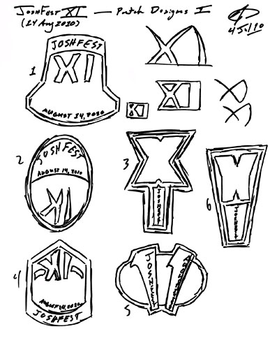 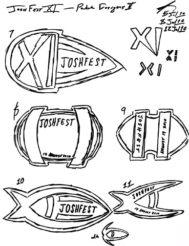
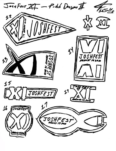 Of the seventeen designs (and ten undeveloped sketches) on these three sheets, my favorites that I thought showed the most promise were #6 ("the stack"), #7 ("the fireball"), #10 ("the fish"), #12 ("the pennant"), and #13 ("the runes"). I ultimately chose #10 as my top favorite and went about developing that. Because it did look a little "Jesus Fishy" I had tried some variants on the theme. #11 was an immediate tweak, which I called "the pliers," while an unnumbered alternative ("the jellyfish timeship") is below. #17 ("the Krenim timeship") is a final thought, reversing the design by having the long arms of the "X" arc to the opposite side of the "I." This had the same design idea and was perhaps more balanced, but just didn't look very dynamic. FEELING BLUE ABOUT THE FIRST PROBLEMS Going in, there was only one real requirement: I wanted a blue and white insignia. 2009 had a fair bit of blue, but it was offset by the big yellow and orange stars. For 2010 I wanted much cooler colors throughout. This was reflected in the initial design in Adobe Illustrator:  Yep. That's definitely a fish. What if I tried reversing the "tail?"  That makes it a little less fishy but at the cost of looking pretty bad. Since that's an unacceptable direction, I reverted back to the first style. FROM THE SEA TO THE STARS One change at this juncture, and it broke my heart, was changing the design to maroon and gold. I had wanted to avoid this because the swooshes of the "X" portion would have seemed clich� if they were gold, but it was necessary. The blue was simply too "aquatic," and the color change could help disguise the fish by giving it more of a "stellar" quality. I honestly wasn't concerned about it resembling a fish. I just didn't want to keep hearing fish jokes come JoshFest. 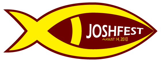 Continuing the tweaking, I tried dramatically changing the length of one leg on the "X." It just looked silly, though I have to admit that reversing the "tail" does look better with the longer leg. 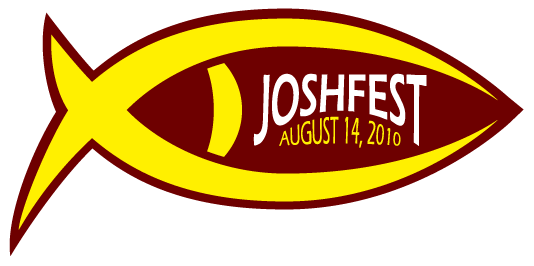 I also tried extending the arc of the "I," but it only worked inside my head: the result was a fine pair of ventral and dorsal fins for my little fish! No no no! Note also the blunted right side, experimenting with working off the fishy shape a bit. I wouldn't stick with this modification. 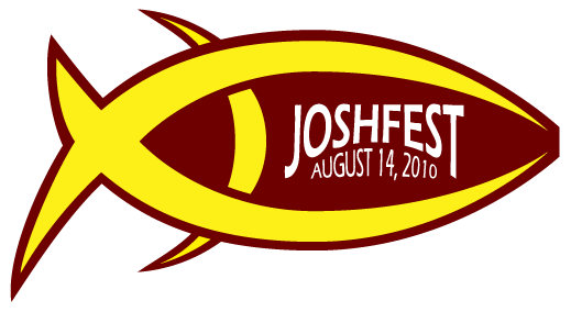 Ah, here's something that worked. Trimming off the upper arc of the "X" while leaving the lower arc in place. The "I" became a slight mirror of the upper right arm on the "X." One thing to note in this version is the flattened top of the patch. Just another experiment that didn't make it since the insignia looked deflated. I quickly went back to the full, symmetrical, rounded top of the earlier design but kept the modified "X" sporting only the lower arc. This stage also solidified the style of the text that would remain, with minor tweaks, until the final design. 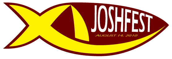 The next step was filling the right-hand side with the arc from the "X," which I thought looked nice. 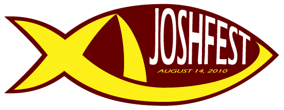 Which led to rounding off the right-hand point, arriving at a place that I really liked. This is where I stood for several days, thinking that I had finally arrived at the final design. This was working for me and I was feeling somewhat maxed out in terms of where to go next. I whipped up the Awkward Club variant, which I always do when I feel the design has reached its completion. 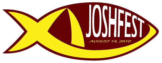
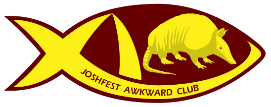 I mean, what could possibly be left to do? ALWAYS ASK THE ART MAJOR There reaches a point in a design where you simply run out of directions on your own. You work it up from something that doesn't quite work into something that does and, at the end of the process, the eyes glaze over. You've been looking at the same design for so long and have tried so many avenues that you just run out. You're tired of working on the same design and want to move on so you might call it finished before you feel truly satisfied. As with the Google Lunar X Prize and the JoshFest 2009 designs, on August 4 I turned to my good friend, the insanely talented art student, Laura. Once I run out of steam on these designs, she can approach them with a fresh perspective and help pinpoint what's not working. Once again, Laura's eagle eye for details nailed the remaining shortcomings. After first making fun of it for resembling a fish, of course. Josh:She attached a very quick rough MS Paint mockup (for she is a busy person and didn't need to mess with Photoshop for this) of an idea for improving the "I," which got the gears turning again.  Josh:STABBING TOWARD THE FINALE Laura's ideas helped reinvigorate my approach to the patch. Sometimes you just need to bounce ideas off of someone willing to bounce them back, and Laura's artistic sensibilities make her very good at this. The idea of piercing the border with the arc of the "X" was just the new direction that I needed. It not only made the design considerably more dynamic but it also got me a little further from looking like a fish. I experimented with the full block "I" derived from Laura's sketch as well as two different hook-shaped "I"s. First up, the full interpretation of Laura's idea, for comparison:  It's very bold and I like that, but the full block "I" seemed to jar with the pointy "X," so I trimmed it in half, angling first to hook towards the "X."  This only returned me to Laura's earlier fault: "it feels like it's pushing 'JOSHFEST' out of the way." Flip it around and ... voil�! The final design is finally reached!  Along with the associated Awkward Club version, for those prone to feeling uncomfortable because there may be guests present that they would rather avoid. 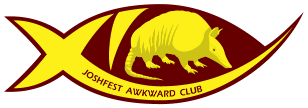 So what, is that it? LAST NAGGING DOUBT Even though I had finally arrived at what I felt was the final design, a place that I was satisfied with and saw little room for improvement, there remained an irritable doubt in my head. Was it still too much like a fish? Did the protruding arc only give the fish a severe underbite? Is this design actually a really stupid misstep? Such doubts are good for the design but too many can lead to hiding it away and starting over. So I sketched this alternative with a dying Sharpie: 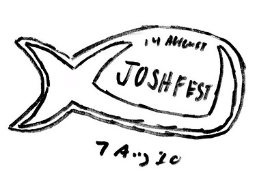 Same idea that I'd been working with, just sticking the "I" out as an extension of the "X"'s arc. No way a fish could be seen here! Maybe a whale, but definitely not a fish. Except that it looked utterly ridiculous and there was no way I was about to give up my finished design for that. Which is really what I needed, a bad direction to reassure me that the finished JoshFest patch actually was pretty good after all. In short, I was ready to own the patch and release it to the public. Still, I sat on it, hoping for some great idea to make it even better and inadvertently wound up forgetting about the patch during the run up to the big day on August 14. Being so busy with the cleaning and arrangements, the graphic wasn't released until the day before. A few final, minor touches were needed and the design went public the evening of August 13, just when I needed to have the graphics ready for JoshFest. 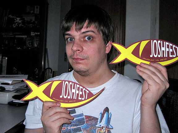
The cut-out insignia, ready to go AT THE BIG JOSHFEST During a JoshFest the event insignia is displayed very conspicuously, and in several locations. It's impossible to miss, so it darn well better be good. Even going in I was still having some doubts. I was satisfied overall, I knew it was a solid design. I just wasn't sure how it would be received -- would it be an unending procession of fish jokes? 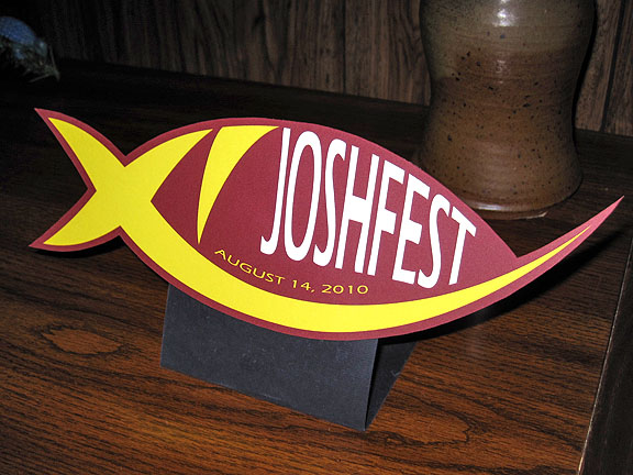
The cut-out insignia on display Turns out I was all worked up for nothing. The insignia was well received and there were a few compliments. What a lovely feeling that was, as my self-doubt evaporated. Continuing a new tradition introduced the year before, I had everyone sign a copy of the patch as a souvenir. Laura rubs it in. 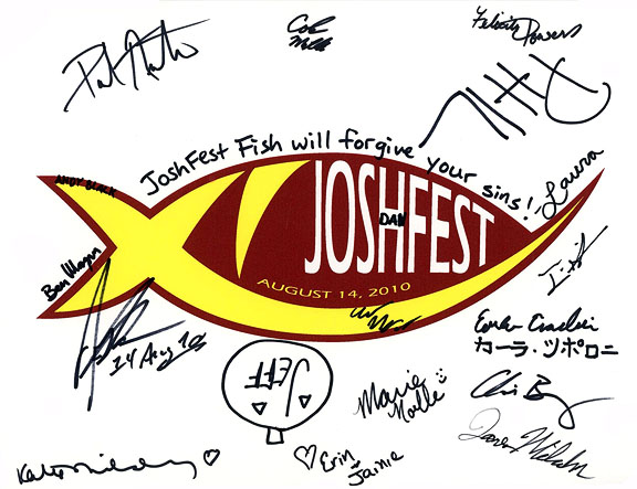
The signed patch And there were the JoshFest Newbie nametags, an idea started in 2010 and never used by anyone. 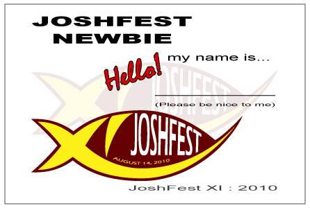
JoshFest Newbie nametag Jeff even surprised us all by bringing a cookie cake with an amazing rendition of the insignia drawn in frosting! Yes, my jaw dropped. I was not expecting that. 
The 2010 insignia on a cookie cake! It wasn't until everyone left and I had a mess to clean up that I settled down and realized how much I actually liked this patch after all, and how well it worked. I was happy in the end. WHAT'S WRONG WITH THE CAKE? What I wasn't happy with was that, in addition to the cookie cake that Jeff brought, there were two other cakes available. One had Richard Nixon on it and one had the Death Star blowing up. The thing is that, despite my urging all throughout the day, nobody wanted cake and no cake really got eaten. Dan took a slice but I think he was feeling sorry for me by that point. Because I needed to get rid of all that cake, I made the next Saturday following JoshFest, August 21, a movie day themed "Eat My Danged JoshFest Cake." And obviously it needed an insignia. The patch for Eat My Danged JoshFest Cake day was simple: a cake with the event's name, dotted by elements from the JoshFest XI insignia. A two-second scribble on a Post-It note on August 16 served as concept. 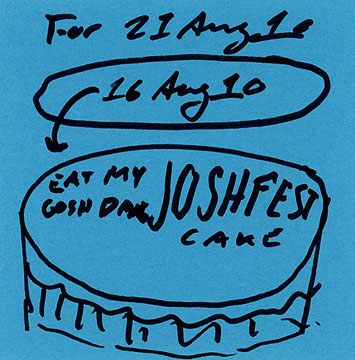 The graphic fell together really quickly. It was easy to draw and the cake was decorated with the "XI" detail from the JoshFest patch as well as fish-shaped sprinkles that were outlines of the JoshFest insignia minus the protruding arc. I admitted defeat on this point. 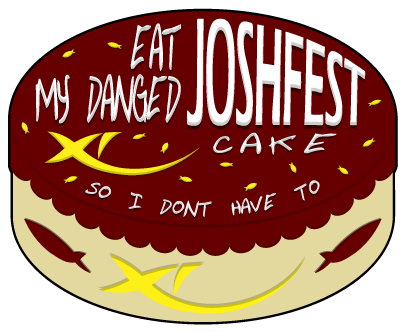 Charles, Felicity, Katie, Dan, and Laura all stopped by and ate a little cake. Not as much as I'd have hoped (really, there was nothing wrong with the cake). I don't understand their en masse aversion to baked goods, but I sure am not providing cakes for future JoshFests. They don't get eaten. BRIDGE Speaking of future JoshFests, on we continue to 2011's JoshFest XII. Typically I would make this a separate article, especially after the length of the discussion about the 2010 design. However, unlike its immediate predecessor, the 2011 patch came together extremely quickly and without difficulty. Moreover, part of its development is a continuation of ideas set up during the 2010 insignia's initial design process. This will be much shorter. 
2011: JOSHFEST XII TIME FOR TWELVE A year passes. Leaves fall, snow is shoveled, flowers bloom anew. Before I realize that April has passed, it's already late July, as 2011 speeds forward through the calendar at a breakneck pace. The end of July means I need to start working on the new JoshFest patch! In approaching each new go 'round, I think back to the previous year and try to remember how that went and if I'd had any design thoughts about this over the intervening twelve months. I remembered the stacked designs #3 and #6 from the 2010 sketch sheets seen above, which were takes on an idea I wanted to experiment with. The Roman Numeral "XII" allowed for a bit of vertical symmetry, with both "I"s falling exactly under the two legs on the "X." As it happened in 2011, I had this idea on May 30 and sketched an early take on this plan, along with a few alternates, to hang on to and think about over the next two months. 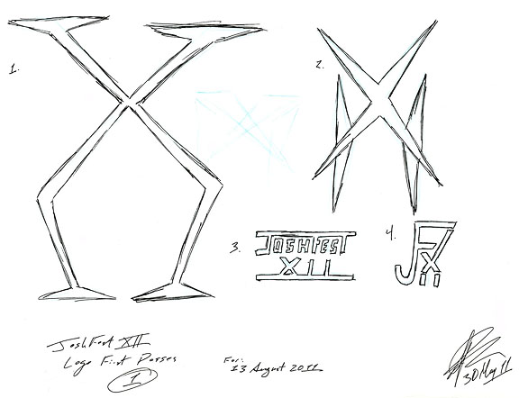 By July 29 I had a much clearer image in my had for the direction to proceed. The whole design process fell into place with surprising speed and ease, a far contrast to previous years' efforts that spread across several pages and required loads of fiddling with details on the final drawing. 2011 was a snap! 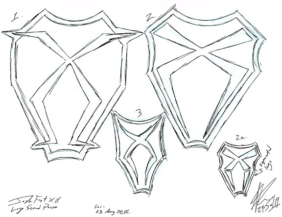 Design #1 in May became design #1 in July on a concept sketch that was already very close to the final version. Design #2 is essentially the same thing, just losing the serifs/crossbars that made design #1 look like a headless, bowl-legged man. Design #2a came later, after I began drawing in Illustrator, for a variant with separated "I"s. Finally, design #3 is one of those ideas that has to be put to paper to realize how bad it is, an attempt to add more curves to the numeral. If only it were always this easy! ILLUSTRATOR'S A BREEZE With a design on paper that I really liked it was time to draw it up in Adobe Illustrator. Color-wise, I still really wanted the blue and white graphic that I had intended the year before and had to abandon. Blue and white it was! The first version came together digitally just as easily as it had come together in the analog medium. This was an interpretation of #2 in the July 29 sketches, with the "I"s connected to the legs of the "X." Note that at this point we were planning to hold JoshFest XII on August 13. On August 5 the event was moved back a week to the 20th, a much more sensible date to hold it on. 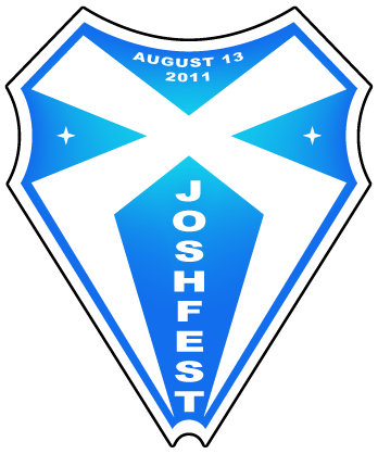 This was the point where I added design #2a, with the separated "I"s. This helped break up the design a lot and made it less of a solid mass. The eyes wander more on this version and the Roman numeral becomes more obvious. This patch was deliberately in-your-face obvious about the numeral. The two smaller four-pointed stars flanking the big "X" form a horizontally-aligned Roman numeral: XXX, or thirty, the age I was turning. The smaller stars were rotated 45 degrees to help mask that slightly. While I wanted the "XII" to be way obvious, I wanted the "XXX" to be slightly less so. 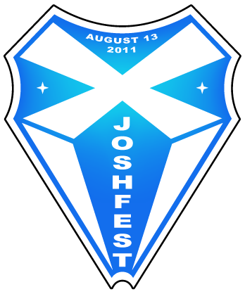 At this point I identified a problem with the concave curve at the bottom. On one hand it seemed overdesigned. On the other hand it kinda sorta maybe slightly resembled a birth canal. There's a time and a place for cervical artwork though that's not to say that JoshFest isn't the perfect venue for it. Anyway, it was really the first reason: the bottom curve was simply too much so I flattened it. And wham bam, change the date, and we have the final design! Easy as pie. 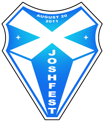 Now just add the hapless armadillo mascot and the Awkward Club patch is complete. I really like the appearance of the phrase "Awkward Club" being punched out of the "X," allowing the background gradient to show through. Typically I try to avoid using gradients on patches, JoshFest IX from 2008 being an exception, because gradients are difficult to embroider. Every insignia I design is intended to be possible to create as an embroidered patch. In this instance it's still embroiderable and does a lot to help the design pop. 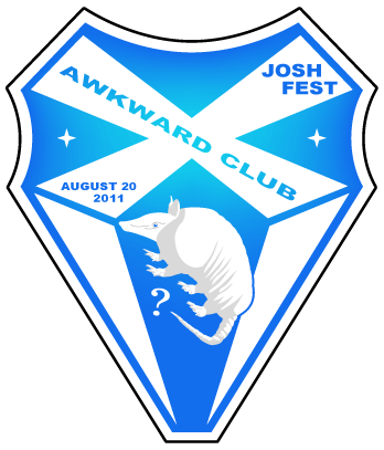 This design was pretty much wrapped up on the day I designed it, July 29. It was necessary to return to it a few days later to change the date but, other than that, no real modifications were necessary. It was released on August 8, twelve days ahead of the event it represented. ALL OVER JOSHFEST I really, really like this one and am proud of how it turned out. Where I went into the 2010 JoshFest with hesitation regarding the patch (that I came to like a lot more once it was over), for 2011 I went into the event with my head held high about the design. I love this one. As always, the insignia were printed and cut out... 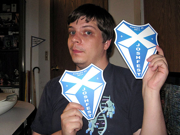
The cut-out insignia, ready to go ... and placed on display all over the place. Just to make sure that nobody forgets where they are. 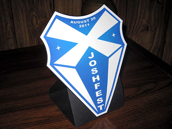
The cut-out insignia on display And once again we had the JoshFest Newbie nametags and, once again, nobody touched them. Which isn't a complaint at all. Even when they were introduced in 2010 I didn't expect anyone to use them because, frankly, it's a ridiculous and stupid idea. But I like making two of them each year just for fun. 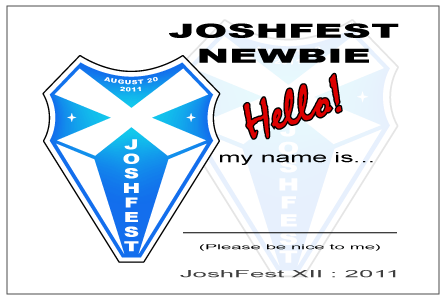
JoshFest Newbie nametag As we did for the two years previous, the copy of the patch signed by everyone who attended. These are my favorite souvenirs from the events, even if this time they thought they were cute with their Sarah Palin and Christine O'Donnell jokes. 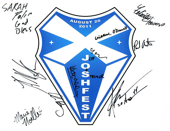
The signed patch Lastly, because of the anti-cake mentality that pervaded JoshFest 2010, I adamantly refused to have any baked goods at JoshFest 2011, and I will continue to do so at JoshFest 2012 in two weeks. Jeff did bring another cookie cake, once again bearing the insignia artwork in frosting! It wasn't quite as finessed as the 2010 cookie, but it was still neat. Those outer curves are probably hard to get right in frosting. 
The 2011 insignia on a cookie cake! This time around the cookie got eaten! Probably because I starved everybody so that the cookie cake was the first actual food they came across. There was no need to hold another Eat My Danged JoshFest Cake event. CONCLUSION That's the story of the JoshFest 2010 and 2011 insignia. Nobody reads these write-ups but that's all right, I pretty much write them for myself. It's been bugging me that I never got around to writing about these two patches and I can rest a little easier now that this article is out of the way. As I write this the new event insignia for JoshFest XIII, scheduled for August 18, has been pretty much done for several days now. There are a few things I'd still like to play with on it, but it's more or less ready to be released, probably some time next week. I will say this: it is green. And then I'll have another article to write. Hopefully it won't take me two years.  Articles Articles
|
 |