


|
27 April 2009 Mr. Andy Black had happened by one evening in mid-March 2009. I'd recently found the few sparse photos of the starship bridge set that I built in the basement a decade ago for the long-aborted Jimmy Joe and the BOX movie (itself an article chock full of images that is currently stewing in my mind), and I was showing him these old pictures. This led to me pulling out the binder with the old set drawings and plans inside -- a combination of ancient reflection and a want to see what all I had left. Set drawings are all well and good but are of little concern in this minor write-up for, as we discovered, an eleven-year old scribble on the back of a plan. A scribble that depicted a logo for Andy that followed much in the same style as my own JG Enterprises insignia: 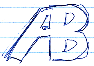 1998: First thoughts I can't for the life of me remember why we tried to design a corporate-style emblem for Andy. The best I can figure was that, since he and I were working on Shumi-Shumi Man VI (SSM6) at the time, that it could have been a production company emblem for his cinematic production entity, Andy Pictures Presents. Perusing the SSM6 binder reveals no designs for any sort of logo for Andy Pictures Presents; only numerous mentions in notes. This hypothesis also suggests why it's so similar to the JG Enterprises logo. Andy Black (AB) or Andy Pictures Presents (APP), as the movie's production firm, were meant to be functional cooperates of JG Enterprises and so would have been working on the same wavelength and continuity as a sister agency. That both films were in pre-production at the same time clouds the original intention of the design as, regrettably, neither the Jimmy Joe movie nor Shumi-Shumi Man ever got made and years of work were perhaps all for naught. But such is the creative process. 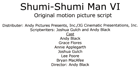 1998, APP's very first mention on the very first draft of the script JG's title would be slimmed down and the cast changed repeatedly 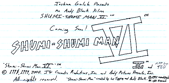 "APP logo TBD" -- As of 2000, still no APP logo on this planning sheet That was 1998. Fast forward eleven years to March 2009 when we uncovered that old scribble on the back of another scribble. This got some rusty gears turning again with the idea of revamping that old insignia into something more refined and appropriate. Out came the paper and Sharpie. Starting from a reimagined update on a post-it note, we expanded to a few useless ideas and some that had merit. 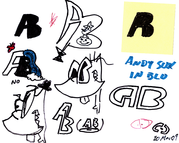 Working out a new direction (click for larger) The letters sprouting from a martini glass ... probably not so good. The lovely waterfall scene could work, but maybe isn't the right tone. The concepts trying to incorporate the letters into my bizarre caricature of the lad are just too complex. Ultimately it came down to the vertical design near the center bottom and the rounded design beneath the horrifically insulting, "ANDY SUX IN BLU." What an burn that was. That final design had the most promise, which we thought slightly resembled the DVD or maybe Blue Ray logos. We never could tell which, though we did toss around a few more riffs on that theme. Anyway, Mr. Black left and I retreated to the darkened confines of my room to fiddle with this idea in Illustrator. I came up with three entirely respectable variants:  Initial variations on a theme (click for larger) Sending the three images off to him for consideration he noted that he preferred the third one the most, so that's the one we settled on. The Andy Black logo (whether he chooses to use it or not in the long run is up to him) still retains hints of that first little scribble a decade ago but is now much more refined to represent more of Andy's personality. It's no longer about producing movies. It's about the man of behind the name.  Andy Black logo (click for larger) Also available without shadow  Articles Articles
|
 |