

|
11 March 2013 INTRODUCTION Okay, so this seems like a really odd choice for an article, what with it being the year 2013 and all, but bear with me here. I'm tackling this article eight and a half years after JoshFest: 2004 for two reasons. The first is that, while the 1999-2006 insignia were all retroactively designed, the 2004 patch was the only one that had a concept sketch beforehand. The second reason is because I'm putting together a JoshFest website and this would make a good addition. There isn't a whole lot to say about this particular patch so I'll also take this opportunity to type a few words about the six emblems representing 1999, 2000, 2002, 2003, 2005, and 2006 as well. SIX AT ONCE I've consistently mentioned that the JoshFest insignia from 1999 through 2006 were all created later, in August 2007. The very first JoshFest patch was for the eighth event in 2007 with every intention of continuing that trend in the future. The problem with that idea was that the seven earlier JoshFests lacked any similar graphical identity and, as future events could all be listed by their insignia, the pre-2007 events would be big ole blank spaces. My solution was one that purists would balk at: retroactively create the missing seven to fill in the blanks. In designing the 1999-2006 insignia I decided to remain conscious both of where my skills were at the time of each event, along with what program I was using at the time. For 1999 up through 2003, I would have been using CompuWorks Draw2 for all my vector drawing needs, moving up to Adobe Illustrator in 2004, which I still use today. That meant that the 1999-2003 emblems needed to have the same limitations as Draw2, which was a difficult program to get complex shapes with. Draw2 was what it was, a cheap vector art program for people who couldn't afford better. For those four patches I looked back at old graphics that I'd created during that period, particularly the relationship patches, of which I had completed eleven by August 1999. That formed the baseline with nowhere to go but up. Oh, and before we go on, why begin with 1999? The reason is that the 1999 event was the one that launched this particular line of yearly August Josh-centric parties that continue today, excepting 2001, when I decided I didn't want to plan and deal with anything. Basically, 1999 was the first where I began shrugging off the notion of "birthday" (though it would take until 2007 to finally abandon that altogether). Birthday parties in the 1990s prior to 1999 were considered just that: one-time days of fun with friends, but ultimately disposable. Beginning in 1999 I began a combination of bureaucratic planning and obsessive-compulsive tinkering that became the staple of what, in 2002, we began calling "JoshFest." The development of event insignia, designed essentially as mission patches, has been discussed before, mostly here and here. The terms "insignia" "patches" "emblems" and "graphics" are all interchangeable. THE DESIGN PROCESS Unlike the later years where JoshFest patches would go through a thorough design process followed by days or weeks of revision, the 1999-2006 graphics were all cobbled together rather quickly in the days before JoshFest: 2007. As a result, the 1999-2006 patches are all a little simpler, perhaps rougher. They didn't receive the same care and attention that went into the patches created later. With not as much thought going into them, here's only a basic rundown of design notes for these insignia, minus 2004, which I'll cover after.
ONWARDS, TO 2004! The reason I've set 2004 aside for special focus is because none of the other seven discussed above were developed in any way before I sat down at the computer. Not that that's necessarily a problem. JoshFests 2007 and 2008 were both created in just that manner, opening Illustrator and getting straight to work, brainstorming there. With 2004 I knew I needed a gameplan before moving pixels because the image in my head needed finessing and fleshing out before stepping into Illustrator. The theme of 2004 had been our attending a showing of Alien vs. Predator following a two-weekend marathon at the Osthimer house of the four Alien and two Predator films, all building toward JoshFest. That had to be represented in the patch, so I went with an H. R. Giger-esque biomechanical alien theme (I later went with a Weyland-Yutani human Company theme for our 2010 marathon). Basically, I wanted claws and veins and some kind of weird phallic porous appendage thing forming a "V" shape, for the Roman Numeral five, this being the fifth JoshFest. Around the appendage were spikes, blades, sharpness, contrasting with the fleshy interior. Basically, something you want to sketch out first.  As you'll see, the sketch is mostly there. The only thing that really changed was the shape along the top of the shield and the size of the outer blades. Also note the date: 15 August 2007. According to my files, I made the final copies of the JoshFest: 2007 graphics on August 16, but I had actually begun drawing it several days earlier. JoshFest that year was on the 18th and the patch was publicly released on the 17th. Basically, that means that I drew up the seven missing JoshFest patches in the days between drawing the 2007 graphic and the day of that year's event. And that's on top of all of the cleaning, indoors and out, and preparations that occupied the week. Days were spent scrubbing, nights were spent drawing. THE FINAL, UNHOLY PRODUCT The final graphic for the JoshFest: 2004 patch was completed the same night as the concept, 15 August 2007. There are a number of refinements from the sketch, which is to be expected, the biggest being he increased size of the outer blades by removing the upper notches from the edges. It also includes the translation of the film's tagline, "Whoever wins, we lose," into Latin: "Quisquid vincunt, perdomus."  This was the fifth JoshFest and the Roman Numeral "V" is a repeated motif here. The shield is roughly "V" shaped, the biomechanical appendage is "V" shaped, the outer blades are curvy "V" shapes, and a sharp "V" slice is cut into the center. Even if you didn't spot all of the repeated "V"s, your mind was still subconsciously aware of them. Officially, the shapes centered where the blades attach to the sides of the shield should be cut out, causing the blades to connect to the shield by two prongs each. Look at the cutout version below to see what I mean. THE PATCH ON DISPLAY Given that this emblem was created three years later, it obviously made no appearance at the actual event, though the ideas and theme behind it were very much on display. One thought that I had during its creation was to incorporate the T-shaped victory markings that the Predators wore in the film and that we wore on our cheeks later that night. This would have violated the "No Hindsight" rule that I spoke of above for 2006. Even without those marks, this patch would have been right at home at the 2004 event. The 2004 patch, along with the other six retroactive designs, made their first JoshFest appearance in 2008, in the form of a stack of printouts sitting on the table in the basement alongside the current patch, press kits from the past year, and other materials. The same held true in 2009. 
In the stack at JoshFest IX, 16 August 2008 Note some of the 99 red balloons at lower right Beginning with JoshFest: 2010, all of the earlier patches were cut out and mounted in a ring on the wall, placing the entire series on full display for everyone attending. 
On the wall at JoshFest XIII, 18 August 2012 Seeing as how each of these "designing" articles winds up featuring a photo of the cutout patch on display, I stuck it to the stand and took a photo. Because I really care so much. 
The cutout patch on display, as it would look if done today LOOKING FORWARD AT THE END That's the story of the event insignia for JoshFests 1999-2006, something that I'd touched upon many times but never discussed in much length. Overall, I'm happy enough with the results and think that they satisfactorily fill in some graphical gaps. It's a pity that it took me so long to begin making event insignia, but they simply had to wait for the right time. In the years before 2007, the year that I began making event insignia, I had considered doing an overall JoshFest Program patch, a single design to represent everything. I dawdled and put it off, not really sure what something like that should look like. Now I'm glad that I never managed to make that program patch, because who knows if I'd have begun doing designs for individual JoshFests if I had. 
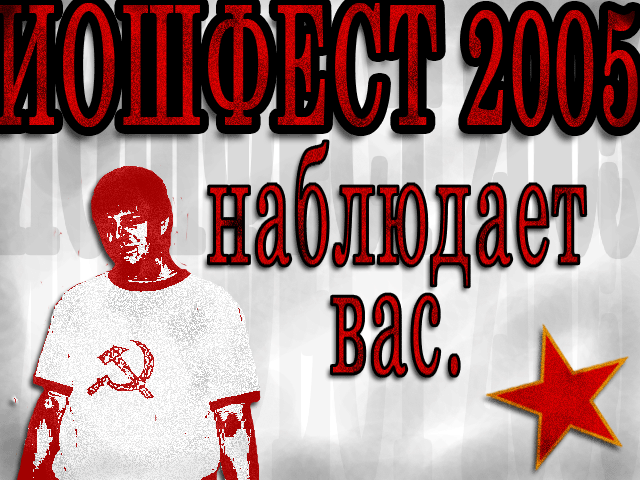
Coming soon to an Internet near you Overall, some of these seven work better than others. In my opinion, the patches for 2000, 2004, 2005, and 2006 best embodied the overall themes for each day while 1999, 2002, and 2003 were generic enough that they could be used for anything. That latter idea actually holds closer to the post-2007 insignia, which don't really hint at any kind of theme simply because JoshFests have become more generic large-scale hangouts and pool parties. There have been occasional themes, like 2008's 99 red balloons (which wasn't represented on the patch) but, overall, they're now much more open-ended than before. That's fine though; since 2009 I've been on more of a stylized numerals kick regarding the JoshFest insignia. At the end of the day I'm happy with all thirteen JoshFest patches. Some I like more than others, some I like less than most, but that's to be expected with a long-running series updated once year-to-year. Styles change, ideas come and go, approaches vary over time. One can only hope to turn out something unique and interesting rather than stale or dull. That said, I can't wait to draw this year's!  Articles Articles
|
 |
||||||||||||||||||||||


